Workshop 4. Introduction to R
Overview
In this workshop, you will get started using R, and you will do basic data exploration. In addition, you’ll get started using ggplot
This workshop will cover the following topics:
- Package installation and loading
- Reading data
- Data exploration
- Making graphics with
ggplot
A great thing about R is that there are thousands of packages freely available. Adding packages significantly expands your data analysis capabilities, therefore, it is an essential task when working with R.
Task - Install and load packages
Install the packages reshape2 and ggplot2.
We will also be using plyr, and this gets automatically installed when you install reshape2.
Load plyr, reshape2 and ggplot2 to your environment.
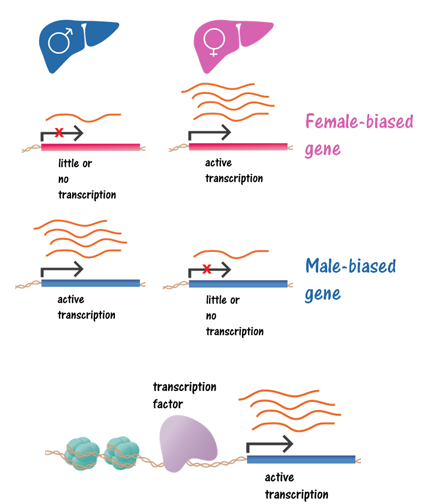
For this workshop, we have chosen a data set that will allow us to illustrate different aspects of data manipulation and plotting. This data set was produced by the Waxman lab, and it is publicly available (Sugathan 2013), and the data for this example can be downloaded here (gene_regulation_in_liver.tab)
This dataset comprises of a gene-wise characterization of transcriptional regulation. Each row in this dataset is a gene that was profiled in male/female mice liver tissue, with columns having important features for each gene, including numeric values for gene expression in each type of tissue, and binary values that indicate whether the gene expression is altered in mice deficient in specific transcription factors.
The following illustrates the biology of differences in gene regulation:
Let’s load the data
Task - Load the data
The file provided is in tab-delimited format. Read the file and assign the data to a variable. In my examples, I’ll refer to this as gene_data. You can quickly check that the import worked with the command head(gene_data).
Does the data have headers?
Now, we are going to do basic exploration of our data.
The first thing we can do, is look at the dimensions of our dataset. This can be done with the dim function.
Another useful function is str. It is used to display the structure of an object, and it is useful because it gives you information on the type of fields you have in your data in a compact view.
A complement to str is the summary function.
A very useful function for categorical data is table, and it gives you the frequencies of each value.
Task - Explore the data
Now, you are ready to answer basic questions about your data. How many genes are there in this set? What is the maximum logRPKM in male? Howe many sex-biased genes are there (Sex.bias field)?
Using the commands introduced in Introduction to the plyr package we can summarize our data in a lot of useful ways.
Task - Use plyr
Compute the mean RPKM expression levels in Male and Female livers for different Sex.bias states (i.e. female, male and sex-independent)”
Now, let’s prepare our data for plotting. For this workshop, we’ll focus on making graphics with ggplot2. This requires the data to be in “long” format, which was introduced in the Intro to reshape video, and the accompanying document
Task - Reshape the data
Prepare the data for plotting by “melting” the data sets. For the following plotting examples, we need two data frames:
- melt of TF KO response, for this, we want the categorical variables Up.regulated.by.PPARa, Down.regulated.by.PPARa, Up.regulated.by.PPARbd, Down.regulated.by.PPARbd to be in one column.
- melt of RPKMs, for this we want logRPKM.in.Male, logRPKM.in.Female to be one column
Now, let’s get started with ggplot!
This section will cover the following topics:
Comparison between ggplot and basic R plots
Elements of ggplot * mapping
- geoms
- stats
Comparison between ggplot and basic R plots
Some plots are quicker or easier to make with base R plots than with ggplot2, but when making complex plots, ggplot2 gives more flexibility
Basic scatter plot
#basic scatter plot in ggplot
ggplot(gene_data,aes(x=logRPKM.in.Male,y=logRPKM.in.Female))+
geom_point()
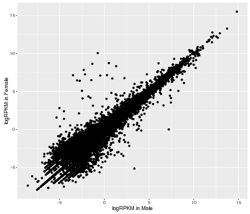
plot of chunk basic-scatter-plot
#basic scatter plot in R base graphics
plot(x = gene_data$logRPKM.in.Male,y=gene_data$logRPKM.in.Female)
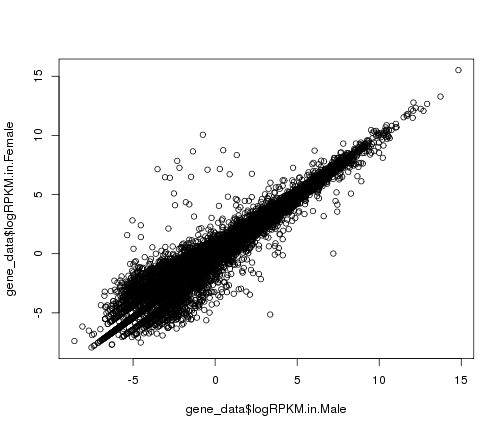
plot of chunk basic-scatter-plot
Complex plot
#complex scatter plot in ggplot
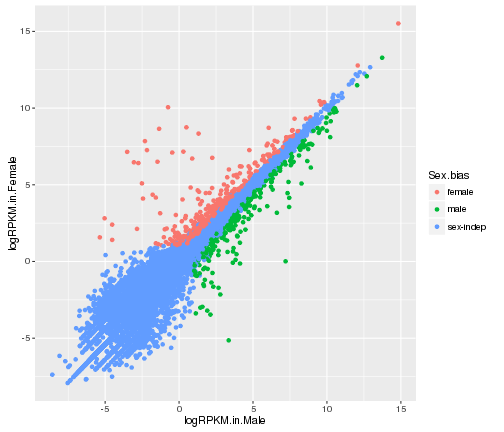
ggplot(gene_data,aes(x=logRPKM.in.Male,y=logRPKM.in.Female,color=Sex.bias))+
geom_point()+
geom_abline(slope=1,color="darkslateblue")

plot of chunk complex-plot-comparison
#complex scatter plot in R base graphics
gene_data_male<-gene_data[gene_data$Sex.bias=="male",]
gene_data_female<-gene_data[gene_data$Sex.bias=="female",]
gene_data_indep<-gene_data[gene_data$Sex.bias=="sex-indep",]

plot(x = gene_data_indep$logRPKM.in.Male,y=gene_data_indep$logRPKM.in.Female,col="steelblue3")
points(x = gene_data_female$logRPKM.in.Male,y=gene_data_female$logRPKM.in.Female,col="tomato3")
points(x = gene_data_male$logRPKM.in.Male,y=gene_data_male$logRPKM.in.Female,col="springgreen4")
abline(a=0,b=1,col="turquoise")
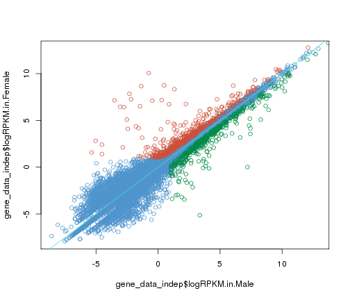
plot of chunk complex-plot-comparison
As you can see, it takes considerably more code to make this plot in base R plots than with ggplot.
Elements of ggplot2
mapping
We tell ggplot how to use information included in the data frame using aes(). In the previous example, we specified the x and y values to plot. In ggplot, characteristics of the plot that depend on data are called aesthetics. In addition to the x and y axis, plot aesthetics include color, fill, size, and shape.
Warning
Note: If we want to change plot characteristics in a fixed way (not based on the data), then we have to specify them outside of aes(). For example, you would do this if you want to change the color of all the points to the same color, regardless of values (we used the value in Sex.bias in the previous example).
As you can see, color is another plotting feature that we can map to our data
Warning
Use colour="hotpink" to set the colors of lines and points. To set the color of filled objects, like bars and box plots, you have to use fill="hotpink". (change hotpink for your desired color)
# color by Sex.bias
ggplot(gene_data,aes(x=logRPKM.in.Male,y=logRPKM.in.Female,color=Sex.bias))+
geom_point()
plot of chunk mapping-with-color
Also, we can use features of our data to generate plots in multiple panels. This can be done using facet_wrap()
# color by Sex.bias and create different panels based on Cluster.in.female.liver
ggplot(gene_data,aes(x=logRPKM.in.Male,y=logRPKM.in.Female,color=Sex.bias))+
geom_point()+facet_wrap(~Cluster.in.female.liver)
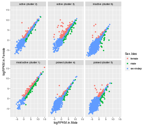
plot of chunk facet_wrap
# color by Sex.bias and create different panels
# based on all the combinations of Cluster.in.male.liver and Cluster.in.female.liver
ggplot(gene_data,aes(x=logRPKM.in.Male,y=logRPKM.in.Female,color=Sex.bias))+
geom_point()+facet_wrap(Cluster.in.male.liver~Cluster.in.female.liver)
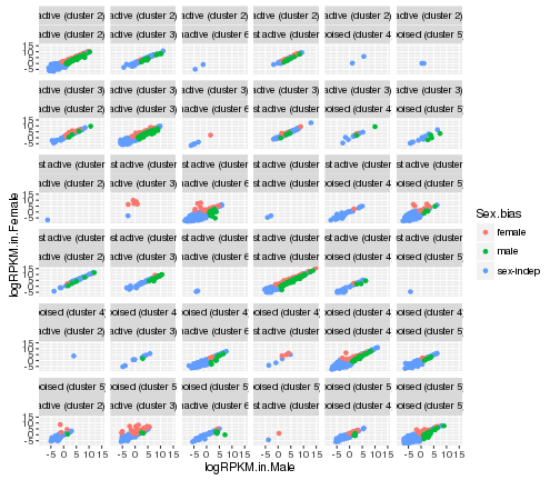
plot of chunk facet_wrap
In these examples, we have used aesthetics to specify x and y values, colors, and panels based on the data. Aesthethics can also be used to map data to the shape of points, types of lines and size.
Visit this site for more examples Shapes and line types
Task - Mapping aesthetics
Use different point shapes to represent the Sex-bias of the genes.
HINT: The shape of points is set using aes(shape=...)
For more details regarding aesthetics, visit the ggplot2 reference
geoms
Geometric objects, or geoms are the symbols used to plot. These also may refer also to the type of plot.
We already used a geom, geom_point for scatter plots, and there are other geoms available, such as
geom_linegeom_bargeom_boxplotgeom_abline,geom_hline,geom_vlinegeom_jittergeom_textgeom_smooth
For the list of available geoms, visit the ggplot2 reference
Now, let’s put those other geoms to use!
Making line plots
Let’s go back to our original scatter plot, and find a line that fits the data
MA_data<-gene_data
MA_data$A<-0.5*(gene_data$logRPKM.in.Female+gene_data$logRPKM.in.Male)
MA_data$M<-gene_data$logRPKM.in.Female-gene_data$logRPKM.in.Male

MA_data_lm<-lm(MA_data$M~MA_data$A)

MA_data_lm$coefficients
## (Intercept)   MA_data$A
## -0.06061486  0.02173641
MA_data$lm<-predict(MA_data_lm,MA_data) ##
In the code above, lm stands for “linear model” and by doing lm(MA_data$M~MA_data$A) we are performing a linear regression on the M and A variables of our data.
ggplot(MA_data,aes(x=A,y=M))+geom_point()+
facet_wrap(~Cluster.in.female.liver)+
  geom_line(aes(y = lm),color="turquoise")
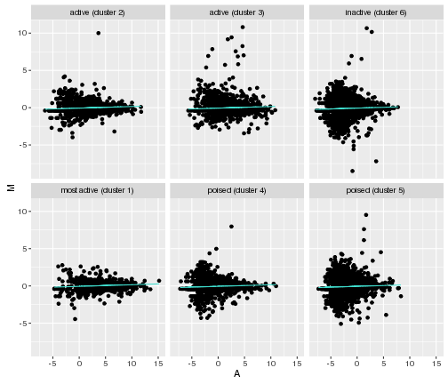
plot of chunk line-plots
Making bar charts
Task - Make a bar chart of counts of genes that are regulated by each knockout
Use the melt of TF KO response data frame to make a bar chart.
This data frame includes values of 0’s and 1’s. For our bar chart, we want to keep only those genes that are regulated, that is, genes with values of 1. Make a bar chart using geom_bar() and fill based on Sex.bias
Sometimes, it’s useful to add information, like statistics, to the plot.
In ggplot, we can use the annotate function, which adds a layer that doesn’t inherit global settings from the plot. It is used to add fixed reference data to plot.
Let’s add a correlation value to our plot
# calculating the correlation, using the R function cor
corr_coef<-cor(gene_data$logRPKM.in.Male,gene_data$logRPKM.in.Female)
rounded_corr_coef<-round(corr_coef,digits = 2)
We can add it to the title of the plot, or to the plot itself
# adding the correlation coefficient to the plot using "annotate"
ggplot(gene_data,aes(x=logRPKM.in.Male,y=logRPKM.in.Female))+geom_point()+
  annotate("text", x = 10, y = -5,
  label = -paste("italic(r) = ", rounded_corr_coef), parse = TRUE)+
  labs(title=" logRPKMs in M and F liver")
## Error in -paste("italic(r) = ", rounded_corr_coef): invalid argument to unary operator
Task - Add statistics to your plot
Add the number of genes and the correlation value to the plot title.
HINT: paste lets you concatenate character vectors
stats
ggplot facilitates some computations on the data.
This comes in handy when we want to summarize the data, rather than visualizing every point.
For example
- box plots require the computation of median, and quartiles
- histograms require the computation of counts in bins
Warning
Different tools might use different calculation methods when making box plots. Always check the documentation so that you know what is on your plot. Check ?geom_boxplot and ?boxplot.stats for more information
For this example, we’ll use our melt of RPKMs data frame that we created earlier
Making histograms
#Making the histogram
ggplot(gene_rpkm_melt,aes(value,fill=variable))+
  geom_histogram()+facet_wrap(~Cluster.in.male.liver)
## `stat_bin()` using `bins = 30`. Pick better value with `binwidth`.
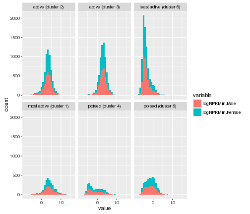
plot of chunk histogram
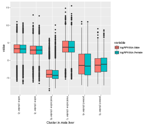
Task - Make box plots
Make box plots of M and F RPKMs for each cluster of activity in male (Cluster.in.male.liver field).
HINT: use facet_wrap to make multiple plots at the same time
BONUS Making plots pretty
The theme function in ggplot2 gives you a lot of control over the look of the elements of your plot.
Theme elements allow you to modify non-data aspects of your plots, such as axes, labels, and backgrounds.
For example, we can rotate the labels on the x-axis
ggplot(gene_rpkm_melt,aes(y=value,x=Cluster.in.male.liver,fill=variable))+
  geom_boxplot()+theme(axis.text.x=element_text(angle = -90, hjust = 0))
plot of chunk label-rotation
A great thing about ggplot2 is that it allows the definition of themes, which is a set of theme characteristics. This makes it very easy to polish the appearance of the graphics consistently for a set of plots.
ggplot2 comes equipped with various built-in themes, including:
- theme_bw()
- theme_gray()
- theme_classic()
- theme_linedraw()
Let’s try a few
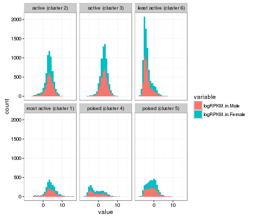
ggplot(gene_rpkm_melt,aes(value,fill=variable))+
  geom_histogram()+facet_wrap(~Cluster.in.male.liver)+theme_bw()
## `stat_bin()` using `bins = 30`. Pick better value with `binwidth`.
plot of chunk histogram-w-themes
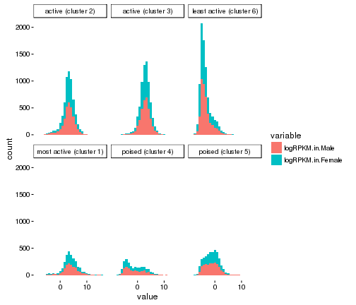
ggplot(gene_rpkm_melt,aes(value,fill=variable))+
  geom_histogram()+facet_wrap(~Cluster.in.male.liver)+theme_linedraw()
## `stat_bin()` using `bins = 30`. Pick better value with `binwidth`.

plot of chunk histogram-w-themes
ggplot(gene_rpkm_melt,aes(value,fill=variable))+
  geom_histogram()+facet_wrap(~Cluster.in.male.liver)+theme_classic()
## `stat_bin()` using `bins = 30`. Pick better value with `binwidth`.
plot of chunk histogram-w-themes
In addition, ggplot2 allows you to save your own themes.
You will also be able to find themes contributed by other ggplot users.
For a variety of predefined themes, visit